I’m so excited today! I’ve been working on a new set of layouts for you all. These are bio layout ideas that I think would look really nice, but also keep things pretty simple and clean. And the best part is that they’re editable and customizable.
These layouts are designed to work in most social media apps (like Instagram, Facebook, etc.), but I have some notes at the end about character limits, supported characters, and appearance differences depending on your device and operating system. If you need help customizing them, just let me know!
Bio Layouts to Copy
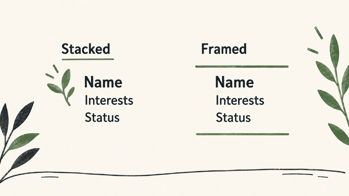
The first layout uses two compact stacks to separate personal details from a short framed arrangement that encloses them. This is my favorite overall design, but it’s also one that can be very easy to mess up if you’re not careful. So I’ll start with this layout.
Compact Stack: ♡ [name] [interest] / [interest] → [short status]
Star-accented Stack: ☆ [name] [short description] [short status]
Divider-Framed Layout: ── ♡ ── [name] [interest] / [interest] [short status] ── ♡ ──
And then there’s this one-line fallback in case the multiline arrangement above doesn’t work out for whatever reason.
Original One-Line Fallback: ♡ [name] / [interest] → [short status]
I’d use a stack to keep personal details on separate lines, or a frame if you want to enclose them. If the actual profile preview looks cramped, or you don’t have enough characters left, try the one-line version. Character limits vary by app, so check the remaining count where you’re pasting it.
Editing Your Layouts
Now, as I said before, these are all editable. You’ll probably want to replace the placeholders with your own personal text. Also, you may want to remove any lines that aren’t necessary or wanted. For example, if you don’t have a “short description” line, you could skip that entire line. But once you do that, you might notice that the spacing looks off. That’s because those layouts were originally meant to be used in a multi-line format, and removing a line will throw off the alignment.
So when editing these layouts, I recommend starting by replacing the placeholders with your own personal information. Then go back and remove any lines that you don’t need. Finally, inspect the destination profile field where you plan to paste this layout. Make sure you like how it looks. Check the line breaks, the spacing, the text wrapping, the accepted characters, the remaining character count, and the overall appearance. Once you’re happy with it, copy and paste it into the destination profile, and save it. Don’t forget to preview the actual profile before saving to make sure that it still looks good. 🙂
Small Edits to Fix Issues
Here are a few practical tips for making small edits to fix any issues that come up during customization:
Wrapping Border – If the border wraps around to a second line, you’ll probably want to shorten the divider lines. If you can’t find anything to shorten, try removing the divider lines entirely.
Shifted Spacing – If the spacing seems shifted, it’s usually due to alignment being dependent on the presence of certain characters. If you remove a line that has those alignment characters, the spacing will shift. Just remove those alignment characters and the spacing should look better.
Excessive Length – If your name is long, or your interests are long, or your status is long, you might need to reduce the length of the text. It won’t wrap automatically, so it’ll either cut off or look awkwardly long.
Unsupported Accent – If your accent isn’t supported, it may show up as a box. The solution is to replace it with another accent that is supported. Or simply remove it.
Unicode Accents – If you use accents made with Unicode characters (like a star), you’ll notice that those accents don’t render as images. They’ll render as text characters instead. There’s no special image app needed, but you might not get exactly what you expect. You’ll just have to check the appearance on your device, operating system, font, and the specific destination field.
Unsupported Character – If you see an unsupported character (a square) in the preview, it means that the character isn’t supported. In most cases, you’ll want to replace it with something else. Sometimes you can change the spacing, but that won’t always solve the problem.
Appearance and Support
Appearance and Support – Keep in mind that appearances can vary quite a bit based on your device, operating system, font, and the specific destination field you choose. So while I’ve tried to give you general guidance, I encourage you to actually preview the edited layout in the destination profile before saving. It’s the only way to be absolutely sure that it looks the way you want it to.
Also, please note that I can’t guarantee that any particular replacement accent or spacing change will render the same on every device. I’ve tested it on my phone, and it looks great to me, but that doesn’t mean that it’ll look the same on your phone.